Beryl
Bike/scooter sharing for the young generation
Role:
Design Consultant/advisor
Skills:
Product Design
Interactive Design
User research
Wireframes
behavioural Design
Systems Thinking
Design Strategy & Advisory Consultative Leadership
Problem
Through my dissertation on developing a bike and scooter-sharing app for university students in worcester, I identified key opportunities to boost engagement within this demographic. When I approached Beryl to share my insights, they showed immediate interest, as they faced challenges with student adoption rates.
Studies revealed over 33% of university members actively use bike-sharing services. Beryl’s existing app struggled to meet the fast, intuitive experience that students expect, often causing potential users to abandon the platform.
As a design consultant leveraging my dissertation expertise on student-focused mobility apps, I independently developed mockup designs and strategic recommendations to help Beryl better target university students. My goal was to redesign aspects of their app to prioritise speed, simplicity, and social connectivity, key factors for students. making the platform more intuitive and faster. This aimed to boost adoption rates within this crucial demographic and strengthen Beryl’s position in the uni mobility market.
Research
I surveyed existing customers within the target demographic, I discovered that 90% had only used Beryl once out of convenience, indicating a critical retention problem. More revealing were the insights from students who had never used the service—they cited the lack of motivation for daily use as the primary barrier, specifically pointing to the absence of rewards for daily users, no usage data or ride summaries to track their activity, and most importantly, no social features that would make the experience engaging or shareable.
Solution
My solution tackled the main issues from my research—lack of incentives and social features—by introducing gamification elements like leaderboards, daily streaks, and badges to boost engagement. The redesigned app featured a cleaner, faster UI with improved UX speed and detailed ride summaries, aligning with students’ expectations for instant, personalised interactions.
Beryl wanted something that would flow easily and not overwhelm which is what i incorporated with the gamification features.
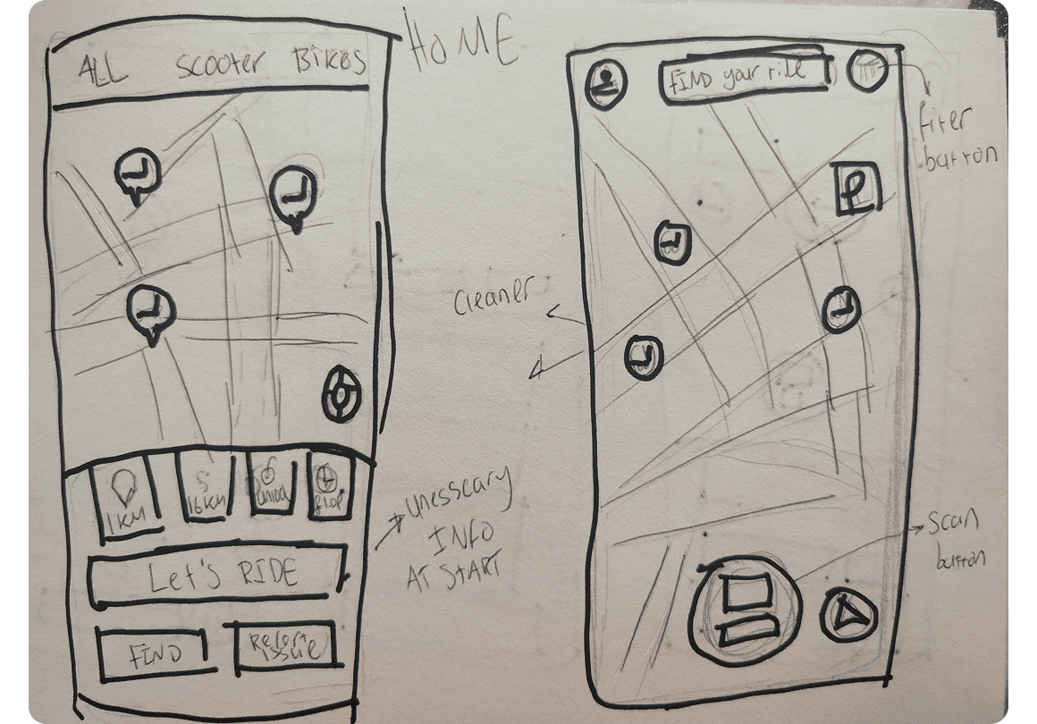
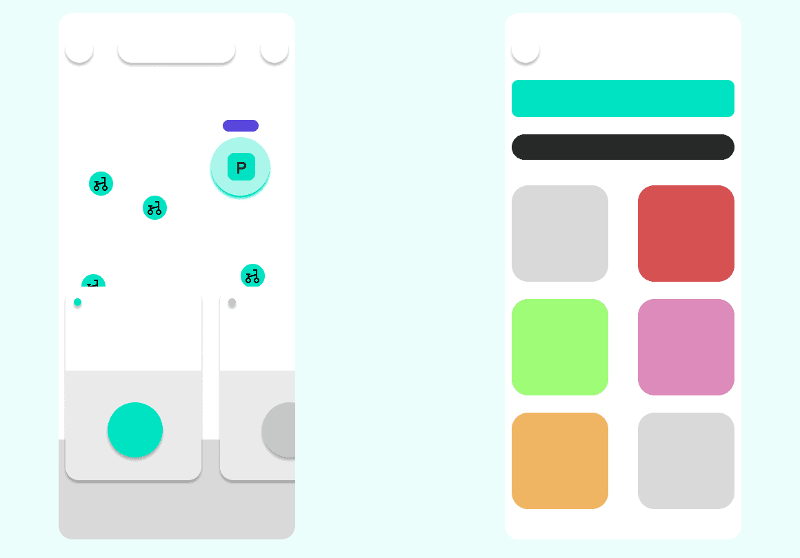
Specifically want a bike or scooter?
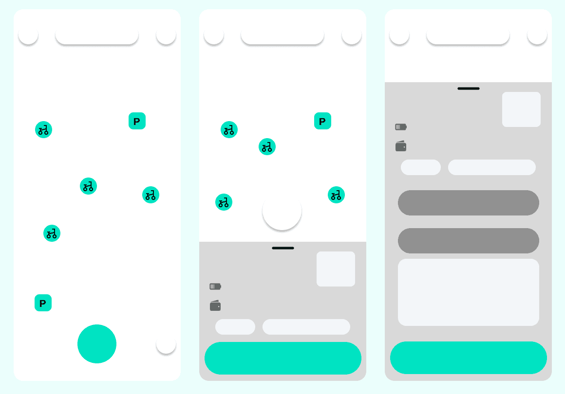
Users are able to filter out easily which mode of transport they desire making the home screen page cleaner and personalised to the users choice.
Ready , set, go!
Users can easily and quickly access a bike with information quickly and cleanly displayed to them.
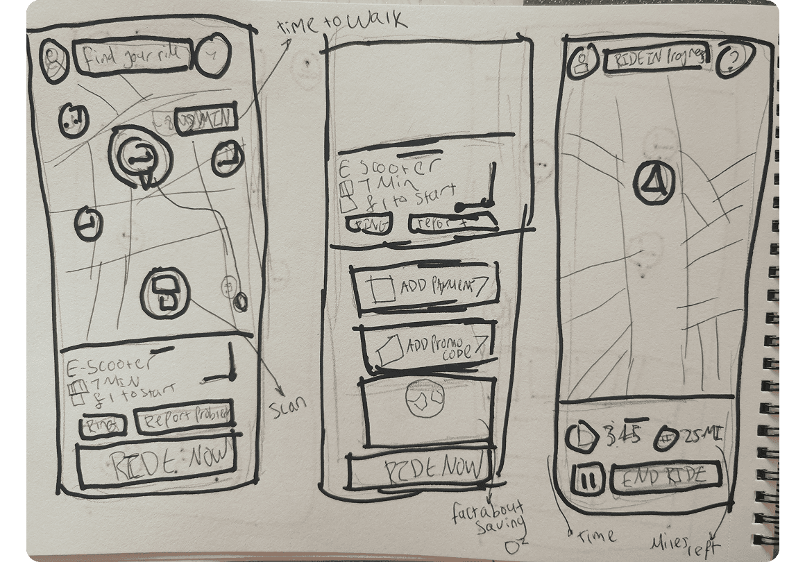
Riding king
Smooth animations when accepting to ride featuring a quick and clear scan system. Incorporated leaderboard in process for small dopamine for users before riding.
all in a good days of work
Live ride info is displayed and users can end a ride with one tap. Users can find out if and what badge they may have unlocked during the ride. At the end a ride summary page is shown and ability to rate a ride giving essential feedback to Beryl.
The parking bay icon presents transportation modes in a clear, streamlined manner. The dropdown menu offers various options and provides quick access to detailed views of the leaderboard and badges.
Results
When I presented the prototype, participants embraced the streaks, leaderboards, and badges, recognising these familiar motivational features. Their positive feedback confirmed that gamification could turn 90% single-use users into regulars.
Beryl’s leadership also appreciated how these features enhanced rather than cluttered the user experience, supporting a simple yet engaging UI/UX. The project showed that well-implemented gamification boosts motivation, social connection, and user retention, transforming occasional users into a loyal, active community.
WANT THE
FULL CASE
STUDY?
eMAIL ME AT
KAIFKREATO@GMAIL.COM